| Entrance | Mainstreet | Wiki | Register |
|
# of watchers: 11
| D20: 19 |
| Wiki-page rating |  Stumble! Stumble! |
| Informative: | 0 |
| Artistic: | 0 |
| Funny-rating: | 0 |
| Friendly: | 0 |


2010-10-27 [Eyonic]: i can try to make it bigger, but it might make it really pixly
2010-10-28 [pegasus1000]: What a great monster. The skull seems to be a helmet.
2010-10-28 [The Dizzy Raven]: I saw this on DA and I was like "WOW!" :D It's a fantastic design!!
2010-10-28 [Eyonic]: hehe thankies
2010-10-28 [Eyonic]: okay it is a bit bigger if you click on it now
2010-10-29 [The Dizzy Raven]: no problem :)
okies ^^
2010-11-05 [Eyonic]: new! this one was me playing around :3
2010-11-06 [pegasus1000]: They are so cute. I have a hard time with the background too. I like the poses you chose.
2010-11-19 [Eyonic]: new-ish
2010-11-19 [Chel.]: DRAGONS DONT SHED TEARS. I kid, I kid...
2010-11-20 [Ravendust]: aww, dragon's cute, hate when critters cry...
2010-11-21 [Eyonic]: tis what the person asked for tho :( made me sad to do
2010-11-22 [pegasus1000]: It looks great. A little fuzzy on the edges. The shading on the background around the head is cool I like how it fades out in circles.
2010-11-22 [Eyonic]: new again
2010-11-22 [Ravendust]: very interesting, never seen a fluffy dragon before, looks kinda like a tiger with wings xP interesting work
2010-11-23 [pegasus1000]: She looks hungry. I also agree with [Ravendust] If it weren't for the long neck and skull differences it would be a tiger with wings. Perhaps try a different color choice, or (I can't believe I am saying this) make the stripes less tiger-like
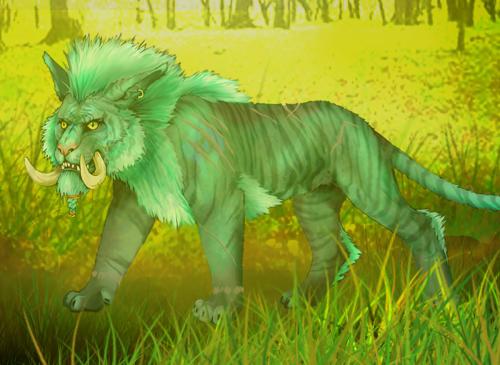
2011-01-19 [Eyonic]: new one, wip tho
2011-01-20 [pegasus1000]: Well, so far so good. I like the colors, (contrasting colors usually work well together) You get extra points for originality: Troll druid: that is just out there and kinda cool. The critique that I have is just two things. 1) I think that the neck is a little to long. 2) the feet in the foreground are facing straight while the feet in the background look like he is turning away, it looks like he is trying to walk in two directions at once. (to me anyway.) I can't wait to see it finished.
2011-01-20 [Ravendust]: interesting piece, I can't wait to see the finished product
2011-01-20 [The Dizzy Raven]: Same :) (agrees with Raven)
2011-04-26 [Eyonic]: new!
| Show these comments on your site |
|
Elftown - Wiki, forums, community and friendship.
|